Creating and editing charts in Layout mode
To create or edit a chart:
1. To create a chart, do one of the following:
•Use the New Layout/Report assistant to create a new layout for the chart. A blank layout works well for displaying a chart. You don’t need to add fields to the layout to plot data in a chart. See
Creating a layout.
To edit a chart, double-click the chart on the layout.
2. In
Layout mode, click the
Chart tool 
in the
status toolbar, then drag a rectangle where you want the chart to appear, or choose
Insert menu >
Chart.
The Chart Setup dialog box appears. You can change settings in the Chart inspector on the right to modify the chart. The preview helps you work efficiently in the Chart Setup dialog box. See
Using the chart preview.
To | Do this |
Add a title to the chart | For Title, type or change the chart title, or click  to specify a title. |
Choose a chart type and specify the data series | |
Change data labels, show or hide tick marks and set tick mark scale (if applicable), and format data | |
Change the color scheme, legend, or fonts in the chart | |
Specify the type of data the chart uses (records in the found set, delimited records, or related records) | |
3. Click Done.
You see a placeholder image of the chart in Layout mode. FileMaker Pro uses sample data when displaying a chart object in Layout mode.
4. Choose Layouts menu > Save Layout, then click Exit Layout.
You see the chart based on data in the database.
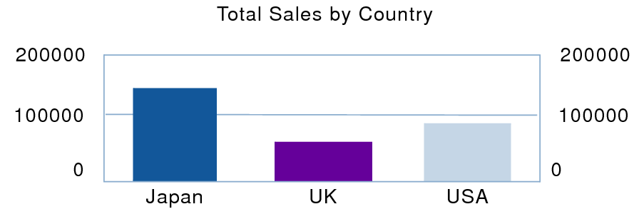
To chart summary data in Layout mode:
For example, to chart worldwide sales by country, sort data by the Country field.
For example, to chart total sales, create a summary field Total Sales that sums the Sales field.
In the Chart inspector, click Chart.
•For X-Axis (Horizontal) or Category Labels (pie charts), specify the sort field.
For example, the Country field.
•For Y-Axis (Vertical), or Slice Data (pie charts), specify the summary field.
For example, the Total Sales field.
In the Chart inspector, click Data Source.
•For Chart Data, select Current Found Set.
•For Chart display when layout is sorted, select Summarized groups of records.
The chart compares total sales by country.
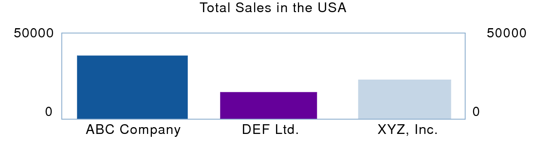
You can also chart summary data by subcategory (for example, total sales by company within one country). To do so, you could change the chart settings specified in this example as follows:
•sort records by the main category, then the subcategory (for example, sort by Country, then by Company)
•set the
x-axis or category labels to the subcategory (Company)
•place the chart in a subsummary layout part sorted by the main category (Country)
This chart compares total sales by company within one country.
Related topics