Contents
Introduction
In FileMaker Pro, you can add custom icons in .svg format to buttons and button bars. SVG (Scalable Vector Graphics) is a W3C XML-based standard used for describing 2D vector graphics. This standard is extensive, and few implementations support its entirety — usually only the most practical subset is implemented. This document describes a specific subset that FileMaker supports for custom icons in buttons and button bars, and provides examples. The implementation of this SVG subset is lightweight, portable, quick to parse, and easy to map to underlying platform-specific graphic rendering libraries. Although this SVG implementation doesn't support every graphical element and option outlined in the standard, the supported features are used often and are capable of rendering a variety of vector images.
For more information on adding icons in buttons and button bars, see FileMaker Pro Help.
Overview of SVG Structure
This example shows a typical minimal SVG file that renders a shape — in this case, a rounded rectangle with a red solid fill and a blue border.
<?xml version="1.0" encoding="utf-8"?>
<svg version="1.1"
xmlns="http://www.w3.org/2000/svg" xmlns:xlink="http://www.w3.org/1999/xlink"
width="200"
height="200">
<rect x="50"
y="25"
rx="5"
ry="5"
width="100"
height="125"
style="fill:red;stroke:blue"/>
</svg>
This SVG file has the following elements:
- The <?xml version="1.0" encoding="utf-8"?> XML declaration provides the version and encoding information. For FileMaker, UTF-8 encoding is preferred and UTF-16 is not supported.
- One <svg> root element with the following attributes:
- version — the SVG version to which the document conforms.
- xmlns="http://www.w3.org/2000/svg" — a namespace declaration that identifies that all SVG elements belong to the SVG namespace.
- xmlns:xlink="http://www.w3.org/1999/xlink" — a namespace declaration that allows an SVG file to contain internal links (such as elements under <defs>).
- width — the width of the image’s viewport in the current user coordinate system.
- height — the height of the image’s viewport in the current user coordinate system.
- Graphical elements (child elements of <svg>), such as <rect>, that describe the various shapes and properties of the image contents.
In general, a graphical element represents a geometric shape and describes how a shape is rendered. It has the following properties:
- Rendering is defined by several XML attributes.
- Some attributes specify geometrical information (for example, position, size, and coordinate transform).
- Some attributes specify display properties information (for example, stroke or fill color).
- Some attributes can be inherited from their parents (for example, a <rect> that is embedded within a <g> would inherit a fill color defined for the whole group).
Supported SVG Elements
The supported SVG elements are:
Category | Elements |
Basic geometric shapes | <line> <rect> <circle> <ellipse> |
Complex geometric shapes | <polyline> <polygon> <path> |
Groupings | <svg> <g> <symbol> <use> |
Definitions | <defs> |
Gradients | <linearGradient> <radialGradient> <stop> |
The most important element is <path>, because most images are composed of complex shapes.
Coordinate System, Transformations, and Units
Coordinate System
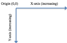
In SVG, a coordinate system is similar to the Cartesian coordinate system — a pair of numbers that uniquely identify a position on a plane. However, the origin is at the top left, the positive x-axis is pointing to the right, and the positive y-axis is pointing down.
Transformations
Transformations establish a new coordinate system inside the element that the transformations apply to. In SVG, this is typically done directly via the transform attribute to achieve the skew, translate, and scale effects. Mathematically, a transformation is a result of multiplying a 3x3 homogenous matrix (representing how to do the transformation) to the current user coordinates.

When transformations are applied in succession, the effect is analogous to the following matrix multiplication chain:

Because only the first six values are used, the vector [a b c d e f] can specify a matrix minimally.
The following are supported types of transformation:
Transformation | Description |
matrix(a,b,c,d,e,f) | Produces vector [a b c d e f].
|
translate(tx ty) | Translates tx along the x-axis and ty along the y-axis. This is equivalent to vector [1 0 0 1 tx ty].
|
scale(sx sy) | Scales sx along the x-axis and sy along the y-axis. If sy is not provided, it is assumed to be equal to sx. This is equivalent to vector [sx 0 0 sy 0 0].
|
rotate(angle cx cy) | Rotates about a given point (cx, cy). The angle is in radians. If optional parameters cx and cy are not supplied, rotates about the origin of the current user coordinate system. |
skewX(angle) | Skews along the x-axis. The angle is in radians. It produces the vector [1 0 tan(angle) 1 0 0]. |
skewY(angle) | Skews along the y-axis. The angle is in radians. It produces the vector [1 tan(a) 0 1 0 0].
|
Units
The only supported unit is the user coordinates, unless noted otherwise. All coordinates and length properties must be expressed without the unit symbols. This limitation applies only to SVG supported by FileMaker.
SVG Shape Display Properties
There are two fundamental drawing operations for every SVG shape: how the edge of a shape is outlined (stroke) and how the interior of a shape is rendered (fill).
Stroke Characteristics
The stroke characteristics define the outline of a shape. A shape's outline is drawn after its interior is filled, and can have the following characteristics:
Attribute | Description |
stroke | The stroke color. |
stroke-width | Width of stroke. It must be given as user coordinates. It is centered along the abstract grid lines. |
stroke-opacity | A number ranging from 0.0 to 1.0, where 0.0 is 100% transparent and 1.0 is 100% opaque. |
stroke-dasharray | A series of numbers that indicate the length of dashes and gaps used to draw a line. These numbers are in the current user coordinates only. |
Fill Characteristics
The following attributes control the way in which a shape is filled:
Attribute | Description |
fill | The fill color. |
fill-opacity | A number ranging from 0.0 to 1.0, where 0.0 is 100% transparent and 1.0 is 100% opaque. |
These display properties can be specified using CSS2 styles for the fill, stroke-width, and stroke attributes.
Example:
<!-- Regular XML style -->
<rect x="20" y="20" width="60" height="30" fill="red" stroke="blue" stroke-width="3"/>
OR
<!-- CCS2 style, which is more compact -->
<rect x="20" y="20" width="60" height="30" style="fill:red;stroke:blue;stroke-width:3"/>
Specifying Colors
Solid colors can be specified in the following ways:
- none to indicate that no outline is to be drawn or that the shape is not to be filled.
- A color keyword name, such as aliceblue, antiquewhite, cyan, lightgray. Refer to the W3C SVG standard for a complete list of color names.
- Hexadecimal digits of the form #rrggbb. Each pair of values describes the individual red, green, and blue color components.
- Hexadecimal digits of the form #rgb. This is a shorthand for the previous method — the digits are replicated so that #rgb is equivalent to #rrggbb.
- The macro rgb(r, g, b). Each color component value ranges from 0 to 255 or 0% to 100%.
- Two different syntaxes can be used to define the display properties of the stroke and the fill operation.
SVG Shapes
<line>
A line can only be stroked. It can have the following attributes:
Attribute | Description |
x1 | The x-axis coordinate of the start point of the line. Default is 0. It must be given as user coordinates. |
y1 | The y-axis coordinate of the start point of the line. Default is 0. It must be given as user coordinates. |
x2 | The x-axis coordinate of the end point of the line. Default is 0. It must be given as user coordinates. |
y2 | The y-axis coordinate of the start point of the line. Default is 0. It must be given as user coordinates. |
transform | See Transformations. This attribute is applied to an element before any other coordinate or length values supplied for that element are processed. |
Example:
<line x1="20" y1="20" x2="60" y2="60" style=" stroke:blue;stroke-width:3"/>
<rect>
A rectangle can be stroked and filled. It can have the following attributes:
Attribute | Description |
x | The x-axis coordinate of the origin of the rectangle (top-left corner) in the current user coordinate system. If the attribute is not specified, the default is 0. |
y | The y-axis coordinate of the origin of the rectangle (top-left corner) in the current user coordinate system. If the attribute is not specified, the default is 0. |
width | The width of the rectangle in the current user coordinate system. Must be 0 or greater; if 0, the element will not be rendered. |
height | The height of the rectangle in the current user coordinate system. Must be 0 or greater; if 0, the element will not be rendered. |
rx | For rounded rectangles, the x-axis radius in the current user coordinate system used to round off the corners of the rectangle. Must be 0 or greater; 0 will produce a square corner. |
ry | For rounded rectangles, the y-axis radius in the current user coordinate system used to round off the corners of the rectangle. Must be 0 or greater; 0 will produce a square corner. |
transform | See Transformations. This attribute is applied to an element before any other coordinate or length values supplied for that element are processed. |
Example:
<rect x="20" y="20" width="60" height="30" style="fill:red;stroke:blue;stroke-width:3"/>
<circle>
A circle can be stroked and filled. It can have the following attributes:
Attribute | Description |
cx | The x-axis coordinate of the center of the circle in the current user coordinate system. If the attribute is not specified, the default is 0. |
cy | The y-axis coordinate of the center of the circle in the current user coordinate system. If the attribute is not specified, the default is 0. |
r | The radius of the circle in the current user coordinate system. Must be 0 or greater; if 0, the element will not be rendered. |
transform | See Transformations . This attribute is applied to an element before any other coordinate or length values supplied for that element are processed. |
Example:
<circle cx="60" cy="60" r="30" style="fill:red;stroke:blue;stroke-width:3"/>
<ellipse>
An ellipse can be stroked and filled. It can have the following attributes:
Attribute | Description |
cx | The x-axis coordinate of the center the ellipse in the current user coordinate system. If the attribute is not specified, the default is 0. |
cy | The y-axis coordinate of the center of the ellipse in the current user coordinate system. If the attribute is not specified, the default is 0. |
rx | The x-axis radius of the ellipse in the current user coordinate system. Must be zero or greater; if 0, the element will not be rendered. |
ry | The y-axis radius of the ellipse in the current user coordinate system. Must be zero or greater; if 0, the element will not be rendered. |
transform | See Transformations . This attribute is applied to an element before any other coordinate or length values supplied for that element are processed. |
Example:
<ellipse cx="300" cy="300" rx="250" ry="100" style="stroke:blue;stroke-width:3"/>
<polyline>
A polyline is a set of connected straight-line segments. A polyline can only be stroked. It can have the following attributes:
Attribute | Description |
points | A list of points of the line segments that make up the polyline. All coordinate values are in the user coordinate system, and there must be an even number of coordinates. |
transform | See Transformations . This attribute is applied to an element before any other coordinate or length values supplied for that element are processed. |
Example:
<polyline points="50,375 140,375 150, 325" style="stroke:blue;stroke-width:3"/>
<polygon>
A polygon is a closed shape of connected straight-line segments. (It's a polyline that must be closed.) A polygon can be stroked and filled, and it can have the following attributes:
Attribute | Description |
points | A list of points of the line segments that make up the polygon. All coordinate values are in the user coordinate system, and there must be an even number of coordinates. The start point and end point are automatically connected to form a closed shape. |
transform | See Transformations. This attribute is applied to an element before any other coordinate or length values supplied for that element are processed. |
Example:
<polygon points="350,75 379,161 469,161" style=" stroke:blue;stroke-width:3"/>
<path>
A path represents an outline of a shape as a series of connected lines and curves. A path is an extension of a polygon that can be stroked and filled. Paths are the most versatile and common elements in an SVG file. You can even create compound paths, which are paths with multiple sub-paths. Path elements are specified with the following attributes:
Attribute | Description |
d | A list of path commands. |
transform | See Transformations. This attribute is applied to an element before any other coordinate or length values supplied for that element are processed. |
Example:
<path d="M 100 100 L 300 100 L 200 300 z" style="fill:red;stroke:blue;stroke-width:3"/>
Groupings
<svg>
This is the root element in an SVG document. It has the following attributes:
Attribute | Description |
version | Specifies the language version this document conforms to. |
x | X-axis coordinate of the origin of the viewport. NOTE: Only 0 is supported. |
y | Y-axis coordinate of the origin of the viewport. NOTE: Only 0 is supported. |
width | The width of the SVG image in user coordinates — it establishes the width of the viewport. Must be 0 or greater; if 0, the image will not be rendered. |
height | The height of the SVG image in user coordinates — it establishes the height of the viewport. Must be 0 or greater; if 0, the image will not be rendered. |
viewBox | A list of four (x y width height) coordinates that can each be separated by white space or a comma. This information specifies a rectangle in user coordinates, which will be mapped to the bounds of the viewport. (It implicitly generates a translate and scale transformation). |
<g>
The group element contains all child elements as a group. Any styles (stroke and fill color) you specify in the starting group element will apply to all the child elements in the group.
Attribute | Value |
transform | See Transformations. This attribute is applied to an element before any other coordinate or length values supplied for that element are processed. |
Example:
<g fill="blue">
<rect x="10" y="10" width="10" height="20"/>
<rect x="40" y="40" width="20" height="10"/>
</g>
<symbol>
The symbol element defines a group of template elements that can be instantiated via a <use> element. By itself, this element is not rendered; it can have the following attributes:
Attribute | Description |
id | Identifier of the symbol. |
viewBox | A list of four (x y width height) coordinates that can each be separated by white space or a comma. This information specifies a rectangle in user space, which will be mapped to the bounds of the viewport of the <use> element. |
preseveAspectRatio | NOTE: Only xMinyMin (uniform scaling) is supported. |
<use>
This element takes nodes from within the SVG document and duplicates them somewhere else. It has the following attributes:
Attribute | Description |
x | The x-axis coordinate of the rectangular region into which the referenced element is rendered. Default is 0. |
y | The y-axis coordinate of the rectangular region into which the referenced element is rendered. Default is 0. |
width | The width of the rectangular region into which the referenced element is rendered. Must be 0 or greater; if 0, the element will not be rendered. |
height | The height of the rectangular region into which the referenced element is rendered. Must be 0 or greater; if 0, the element will not be rendered. |
xlink:href | An IRI reference to another element in the SVG file. |
Example:
<?xml version="1.0" encoding="utf-8"?>
<svg version="1.1"
xmlns="http://www.w3.org/2000/svg" xmlns:xlink="http://www.w3.org/1999/xlink"
width="300" height="300" viewBox="0 0 100 30">
<defs>
<symbol id="MySymbol" viewBox="0 0 20 20">
<rect x="1" y="1" width="8" height="8"/>
<rect x="11" y="1" width="8" height="8"/>
<rect x="1" y="11" width="8" height="8"/>
<rect x="11" y="11" width="8" height="8"/>
</symbol>
</defs>
<use x="45" y="10" width="10" height="10" xlink:href="#MySymbol"/>
</svg>
Definitions
<defs>
This is a container element for other referenced elements (for example, shapes or gradients). It should be the first sub-element of <svg>. Referenced elements will have the id attribute defined. These objects are rendered only if they are referenced.
Example:
<defs>
<rect id="Rect1" x="1" y="1" width="8" height="8"/>
</defs>
Gradients
A gradient is a smooth transition from one color to another. There are two main types of gradients in SVG: linear and radial.
<linearGradient>
Linear gradient limits are defined by a line vector. This element has the following attributes:
Attribute | Description |
x1 | The x-axis coordinate of the start point of the gradient vector. If the attribute is not specified, the default is 0%. |
y1 | The y-axis coordinate of the start point of the gradient vector. If the attribute is not specified, the default is 0%. |
x2 | The x-axis coordinate of the end point of the gradient vector. If the attribute is not specified, the default is 0%. |
y2 | The y-axis coordinate of the end point of the gradient vector. If the attribute is not specified, the default is 0%. |
gradientUnits | Can be either userSpaceOnUse or objectBoundingBox; objectBoundingBox is the default.
|
<radialGradient>
Radial gradient limits are determined by a circle, where the center is the 0% stop point and the outer circumference defines the 100% stop point.
Attribute | Description |
cx | The x-axis coordinate of the center of the circle. If the attribute is not specified, the default is 50%. |
cy | The y-axis coordinate of the center of the circle. If the attribute is not specified, the default is 50%. |
r | The radius of the circle. If the attribute is not specified, the default is 0%. |
gradientUnits | Can be either userSpaceOnUse or objectBoundingBox; objectBoundingBox is the default.
|
<stop>
The gradient stop elements control the colors used in the gradient. This element has the following attributes:
Attribute | Description |
offset | Ranges from 0 to 1, or from 0% to 100% — indicates where the gradient stop is placed. For linear gradients, it represents a location along the gradient vector. For radial gradients, it represents a percentage distance from (cx,cy) to the edge of the outermost or the largest circle. |
stop-color | Indicates what color to use at that gradient stop.
|
stop-opacity | A number ranging from 0.0 to 1.0, where 0.0 is 100% transparent and 1.0 is 100% opaque. |
Example:
<?xml version="1.0" encoding="utf-8"?>
<svg version="1.1"
xmlns="http://www.w3.org/2000/svg" xmlns:xlink="http://www.w3.org/1999/xlink"
width="300" height="300" viewBox="0 0 100 30">
<defs>
<linearGradient id="MyGradient">
<stop offset="5%" stop-color="#F60" />
<stop offset="95%" stop-color="#FF6" />
</linearGradient>
</defs>
<!-- Outline the drawing area in blue -->
<rect fill="none" stroke="blue" x="1" y="1" width="798" height="398"/>
<!-- The rectangle is filled using a linear gradient paint server -->
<rect fill="url(#MyGradient)" stroke="black" stroke-width="5" x="100" y="100" width="600" height="200"/>
</svg>
Fill Color Styles
In an SVG image, a color can be applied to the fill property for the following SVG shape elements: <rect>, <circle>, <ellipse>, <polygon>, and <path>. As a result, SVG image icons can be saved to FileMaker Pro themes and their appearance can be dynamically updated. To apply color to an SVG element, ensure that the fill color is not explicitly set on the element in the SVG image file.
FileMaker Pro adds a top-level <g class="fm_fill"> element to the SVG image before the image is saved in the FileMaker Pro file. The fm_fill property indicates that the SVG element's default fill color property is specified by FileMaker Pro, either by the layout theme (through the Inspector in Layout mode) or as a result of conditional formatting. Because an element's fill property is inherited from its parent, all descendent elements of <g class="fm_fill"> will automatically inherit the default fill color.
Example:
<?xml version="1.0" encoding="utf-8"?>
<svg version="1.1"
xmlns="http://www.w3.org/2000/svg" xmlns:xlink="http://www.w3.org/1999/xlink"
width="200"
height="200">
<!-- NOTE: The fill color for the rectangle is not explicitly specified. -->
<rect x="50"
y="25"
rx="5"
ry="5"
width="100"
height="125" />
</svg>
FileMaker Pro then generates this SVG image before saving to disk:
<?xml version="1.0" encoding="utf-8"?>
<svg version="1.1"
xmlns="http://www.w3.org/2000/svg" xmlns:xlink="http://www.w3.org/1999/xlink"
width="200"
height="200">
<!-- NOTE: The top-level group will have the default color fm_fill (from the layout theme, the Inspector, or conditional formatting). -->
<!-- All descendent elements of the top-level group will use this default fill color, unless explicitly overridden. -->
<g class="fm_fill">
<!-- NOTE: No fill style color was specified; the rectangle has a fill color. -->
<rect x="50"
y="25"
rx="5"
ry="5"
width="100"
height="125" />
</g>
</svg>
© 2015 FileMaker, Inc. All Rights Reserved.
FileMaker, Inc.
5201 Patrick Henry Drive
Santa Clara, California 95054
FileMaker and FileMaker Go are trademarks of FileMaker, Inc. registered in the U.S. and other countries. The file folder logo and FileMaker WebDirect are trademarks of FileMaker, Inc. All other trademarks are the property of their respective owners.
FileMaker documentation is copyrighted. You are not authorized to make additional copies or distribute this documentation without written permission from FileMaker. You may use this documentation solely with a valid licensed copy of FileMaker software.
All persons, companies, email addresses, and URLs listed in the examples are purely fictitious and any resemblance to existing persons, companies, email addresses, or URLs is purely coincidental. Credits are listed in the Acknowledgements documents provided with this software. Mention of third-party products and URLs is for informational purposes only and constitutes neither an endorsement nor a recommendation. FileMaker, Inc. assumes no responsibility with regard to the performance of these products.
For more information, visit our website at http://www.filemaker.com.