Charting summary data
In FileMaker Pro, you can chart summary data based on the found set.
Tip To learn more about charting summary data by following steps in an example, see Example 2: Charting summary data.
|
1.
|
Sort data by the appropriate break field to form groupings (categories) of data. See Sorting records by subsummary values.
|
|
2.
|
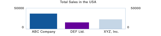
For example, to chart total sales, create a summary field Total Sales that calculates the total of the Sales field.
|
3.
|
Create a chart in the body, header, footer, or grand summary part of the layout in which you want the chart to appear. See Creating and editing charts.
|
|
•
|
For Horizontal (X) Axis (Vertical (X) Axis in horizontal bar charts and Label Data in pie charts), specify the sort field.
|
|
•
|
For Vertical (Y) Axis (Horizontal (Y) Axis in horizontal bar charts and or Value Data in pie charts), specify the summary field.
|
|
•
|
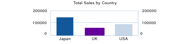
You can also chart summary data by subcategory (for example, total sales by company within one country). To do so, you could change the chart settings specified in the example above as follows:
|
•
|
For information on how chart placement affects the data displayed in a chart, see Placing your chart in the appropriate layout part.